Introduction to Data Science Capstone
Udacity
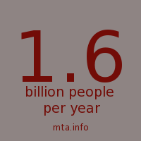
The New York Subway system spans 842 miles of track with 468 stations and transports about 5 million people a day. But those are just large numbers, first we need to get a feel for the data. What does the precipitation look like throughout the year? What does the ridership look like on an average day? Can we predict ridership with the given information?
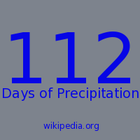
The dataset I am using to answer these questions is turnstile data from 2013 collected over the entire city, however, I am limiting mine to the most consistent station for reporting data: Wall Street. I also signed up for an API on Weather Underground to get hourly data for the same year. Let’s take a look at precipitation throughout 2013.
 |
| Precipitation in New York 2013: Shows rain and snow amounts throughout the year. |
This graph has all 365 days of the year with the precipitation of each hour arrayed along the horizontal axis. The alpha of the dots shows us the intensity of the rain in the hour. The most intense rain in an hour recorded 1.06 inches. Given that information and that the alpha setting needs to be between 0 and 1, I normalized all the rest of the rain data against that value giving us an alpha gradient and a decent visualization.
It gives us a sense of the precipitation, but we also need a good view of ridership throughout the year. However just creating a line graph or a scatter plot won’t really help us visualize the data. The first thing to try would be averaging all the hours to get an average day’s ridership.
After some file size issues, data had glitches from when a turnstile would cut-out, and I also found that the reporting time of every four hours to be problematic, especially when a single turnstile would report during an off hour.

I found that the only station to get nearly continuous updates was the Wall Street station. It is only missing a total of 21 reports for the entire year. So I ran it through a series of filters designed to get rid of steps and glitches and came up with a graph that looks much more like a counting line:
Running it through some SQL queries in pandas I got the average ridership per hour so that we can compare it to our rain data, at least visually.

The interesting thing with the entries data is that morning rush hour is quite a bit more than the really early morning, but it never really slacks off at lunchtime, in fact there are more and more entries until a peak of about 2,750 entries at 18:00.
But does this correspond at all to our weather data? As it has one similar axis I could flip it so that the axes match up and then have a dual axis along the bottom.
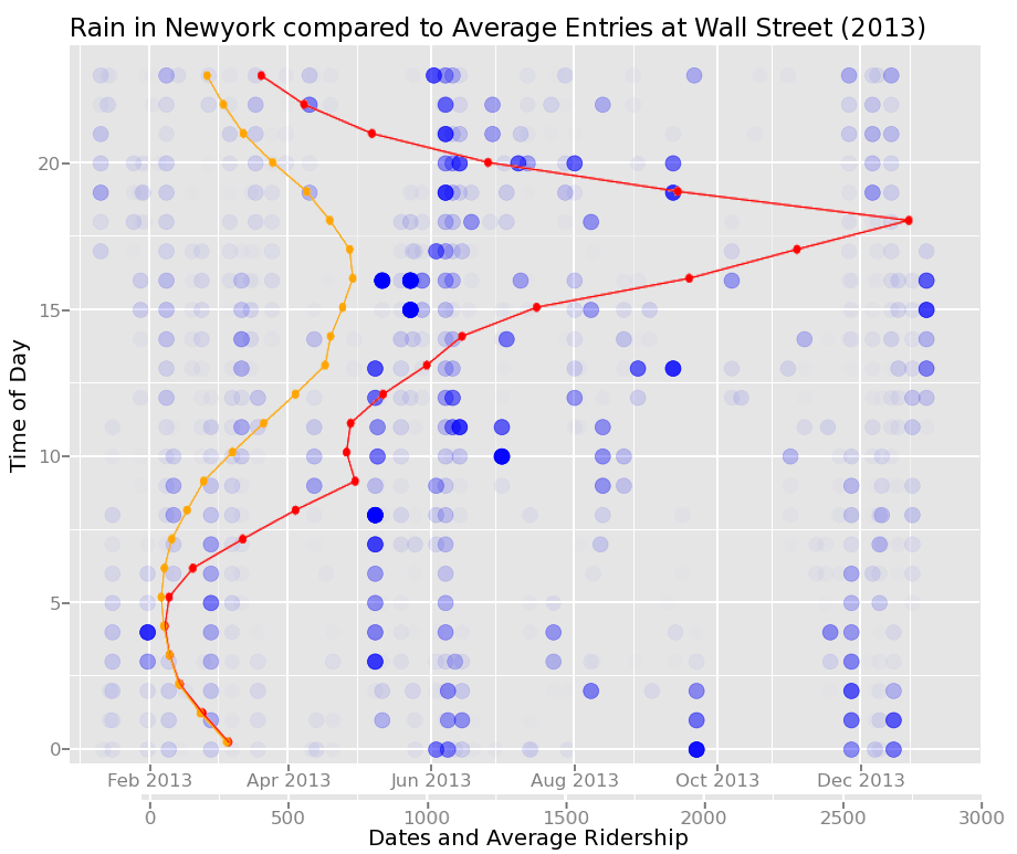
This is the result with the red line as the average day/workday throughout the year and the orange line denoting the weekend days. It might just be a fluke of the climate, but it seems June’s heavy rain-showers correspond quite nicely with the uptick in traffic at 18:00. However, this is also about the time most people are leaving the non-residential district to head back home after a day of, ironically, pushing numbers to get better results.
Although visually biasing the graph really doesn't tell us what we want to know, and this is where we turn to regression.

It seems that the best predictor of subway foot traffic is time. With over a thousand more hours predicted within 1000 commuters compared to using just weather, which is more than ten percent of the data set, deciding when to ride the subway will affect the number of people riding with you more than if it is raining.
However, I was wondering what a different algorithm might be able to tell us. What might a machine learning model be able to predict, possibly trained on different parts of the year? So I turned to scikit-learn to go through a few different algorithms.
At first I tried a Bayesian Ridge which is very similar to the algorithm used in the class and that I modified to use on this data. Its results were nearly the same, although I was able to get some very interesting overfitting using the entirety of the year as a learning set. Otherwise it seemed that somewhere in April had a set of data that was the best at predicting the entire year. When I checked the r-squared value I was a bit surprised: 0.23. Not as good as I was hoping despite the graphs showing much of the predictions within one thousand passengers.
 |
| AdaBoost compares quite favorably to the regression used in class. It also has an r-squared value of nearly 0.53. |
 |
| Both algorithms have problems predicting the evening rush-hour numbers, however AdaBoost seems to recover for later in the night. |
I also tried the AdaBoost algorithm which sets up multiple prediction agents rather than just weight the inputs. With this algorithm the predictions got an r-squared of 0.52, quite a bit better. Still the driving factor behind all of these predictions is time, and I could probably get an even better result by separating the weekends and holidays out of the weekdays. And a problem with the AdaBoost algorithm: it isn’t completely repeatable with minimum controls as it gives a different distribution each time, but seems to maintain the r-squared value.
 |
| Difference of ridership against prediction (red) and precipitation (blue) show that not the prediction algorithm was not greatly affected by precipitation, getting predictions nearly right and quite wrong. The deepest red dots are predictions off by nearly twice the highest average traffic, about 6000 riders. |
Generally it seems that the majority of people using the Wall Street station use it all of the time, that and the people who don’t either continue walking or using other transportation despite most weather.
The last thing to consider is the different mapreduce options. First of all the whole dataset isn’t truly that large, at 60MB it certainly bogged down my computer and ran into system timeouts, but removing those limits and putting in a few more Gigs of RAM to deal with copies easily would go a long way to solve these problems, not really in the realm of true need of MapReduce.
To get into this realm we might look at something that could be a bit more complicated. Real time tracking of entrances and exits on the subway system to get a much finer grain picture of the entire system would certainly get close to qualifying, especially if you wanted to more than just swim in the data.
Another future application of real time systems maybe routing traffic with a pay-or-get-paid system for taking city-wide data and destinations and crunching it down to route traffic. If a person needs to be somewhere quickly they can pay a fee to take a faster route while those taking slower routes would get paid to wait. With the advent of self-driving cars this might not be as onerous as one might think as the people stuck in the slow traffic could possibly work, that or their company can pay for them to use the faster routes to be in more quickly.
But dealing with hundreds of thousands of inputs every minute would definitely need a system that could split up the tasks between servers or possibly server farms. Being able to predict problems or heavy loads becomes a necessary issue.
Most of these traffic issues, whether subway or cars, can be predicted most easily using times and events, the only time that weather is truly going to affect traffic patterns will be in extreme or catastrophic situations. If you are pinning your hopes on getting a seat on the subway because of weather patterns then you might get a seat just before the subway shuts down during a snow day.
References:
https://www.udacity.com/course/ud359 - Udacity course
http://ggplot2.org/ - python plotting library
http://www.wunderground.com/weather/api/ - Weather data
http://web.mta.info/developers/download.html - New York subway data
http://scikit-learn.org/stable/ - Regression algorithms
http://ggplot2.org/ - python plotting library
http://www.wunderground.com/weather/api/ - Weather data
http://web.mta.info/developers/download.html - New York subway data

.gif)
No comments:
Post a Comment